Transport is one of the main items of household expenditure, typically accounting for about 13 per cent of all spending. Traditionally, it has been grouped with food and housing (including fuel and power) as one of the three major items of expenditure (all about the same level), but more recently recreation and culture have emerged as a fourth equal partner (ONS, 2013). In real terms, the amount spent on transport per week has declined since 2001– 2002 (£87.1 in 2012 prices or 17 per cent of total household expenditure) to 2012 (£64.1 in 2012 prices or 13 per cent of total household expenditure). This is a substantial change, amounting to about a 26 per cent reduction, and so in terms of overall expenditure less is spent on travel and this may have helped reduce inequality.
The proportion spent on private transport has reduced marginally to about 84 per cent of all transport expenditure, with a small increase in the public transport share. Within the private transport allocation, the amount spent on the purchase of vehicles has reduced substantially from 52 per cent of the total to 32 per cent, and the amount spent on fuel has increased from 30 per cent to 46 per cent. Other costs such as repairs and servicing have remained constant over the 10 year period. Expenditure on public transport services has increased to about 16 per cent of the total, with spending on rail and tube fares increasing rapidly to reflect both increased use and higher fares, with other increases being recorded in expenditure on air and other transport (e.g. taxis).
Within this picture of change over the last 10 years, a more detailed analysis of the 2012 data can be undertaken (table 4.2) to illustrate the scale and nature of the differences between households in the different income deciles. The three lowest deciles spend between 8–10 per cent of their disposable income on travel, with about 80 per cent of this being allocated to private transport. The proportion of disposable income for the next four deciles increases to 12–13 per cent being spent on travel, and about 85 per cent of this is on private transport. For the top three deciles, the proportion increases to 14–15 per cent, but slightly less (about 83 per cent) is spent on private transport. This is because the three highest income deciles also spend substantially on public transport services (mainly rail and air).
Table 4.2. Weekly household expenditure by disposable income 2012 for UK
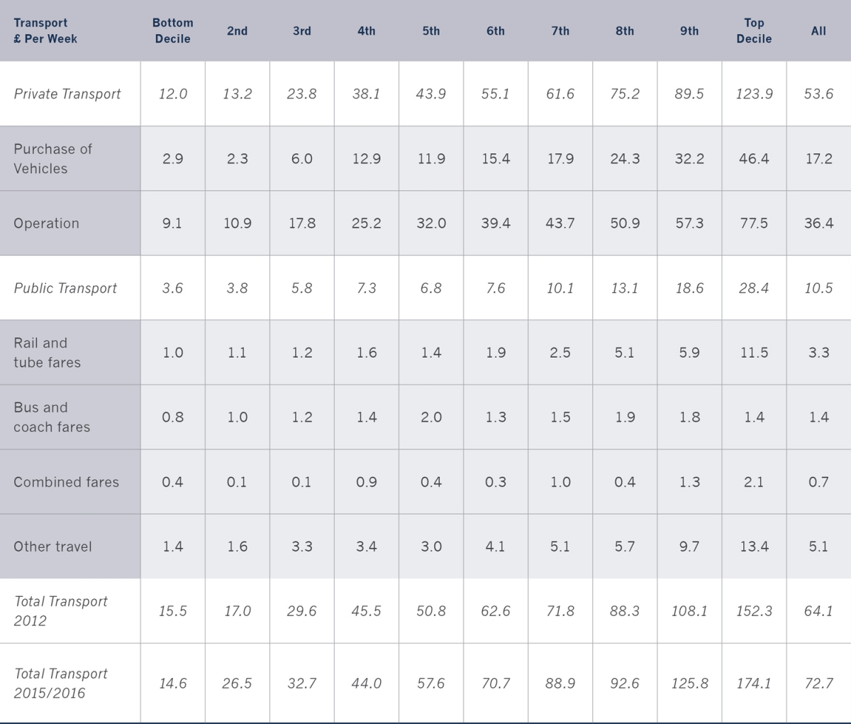
Notes: Total Transport is the sum of Private Transport and Public Transport; ‘Operation’ includes spares, accessories, fuel, repairs and servicing and other motoring costs; some of the numbers do not sum due to rounding; ‘Other travel’ includes air (but not the air fare component of package holidays abroad), taxi, minicab, ferries and private hire bus (including school bus). The 2012 figures have been used to be consistent with other data used in this chapter. The 2015/2016 figures are also given in the table.
Sources: Based on ONS, 2013, table3.1 and ONS, 2017, table 3.1.
It should also be noted than between 2012 and 2015/2016 there has been a real increase of 9 per cent in the amount spent on transport by households (inflation was 4.1 per cent over this period), and that transport is now the most important single item of household expenditure (14 per cent). This increase can be explained by the rise in public transport fares, as household expenditure has risen by more than 60 per cent over the 4 year period, mainly on fares as the number of public transport trips only grew by about 5 per cent.
There is much debate in the energy literature on the issue of fuel poverty, where it is seen that a household is in poverty if more than 10 per cent of income is spent on heating and other energy uses (including hot water, cooling, lighting and appliances) (Boardman, 1991). This simple definition has been extended to include those households where the ‘required’ fuel costs were above the national median level, and where their residual income left them below the official poverty levels. The Low Income High Costs (LIHC) indicator measures poverty according to household income, household energy requirements and fuel prices (DECC, 2013). If viewed in this way, it would seem that transport poverty does not exist, even for the lowest three income deciles, and despite the possibility that within each of these categories there may be individual households who spend more than 10 per cent of their disposable income on transport in 2012.
Inequality does exist in the expenditure patterns across the 10 income categories, with those in the top decile spending more than 10 times as much on private transport as those in the lowest decile, and the public transport multiplier is nearly 8 times. The differences between the two extremes are even higher for the purchase of vehicles (16 times) and for expenditure on rail and tube fares (11.5 times). The least variation is in the bus and coach fares category where the multiplier is less than 2 times, suggesting that in terms of expenditure the bus (coach) is the most equitable form of transport as measured by disposable household expenditure. These patterns are replicated in the latest figures (2015/2016), but the magnitudes of the differences between the richest and poorest households have changed with the increase in public transport expenditure coming mainly from the higher income groups.
In addition to differences in patterns of expenditure, there are also regional variations across England and Wales (2012). Londoners spent most on public transport (bus, rail, tube and other services) and least on private transport, even though the average household income level is much higher than elsewhere. Overall, this means that the percentage of disposable household income spending on transport in London (2009–2011) was 11.6 per cent, considerably less than the England average of 13.3 per cent. Conversely, households in the West Midlands (14.2 per cent), the East Midlands (14.5 per cent), the South West (14.4 per cent) and the South East (13.9 per cent) all spent above the average levels, reflecting more trips and longer average journey lengths (ONS, 2013).
Over the 10 year period, the breakdown of household expenditure between private and public transport has only changed marginally, with about 85 per cent being spent on private transport (2002, and 84 per cent in 2012) and 15 per cent on public transport (2002, and 16 per cent in 2012). The proportion spent on public transport is highest for low-income groups (for both dates), and in 2002 this proportion decreases up to the 7th income decile, and then increases again. The same pattern is apparent in 2012, with the lowest expenditure on public transport in the middle-income range (the 5th and 6th deciles). It is the rich and the poor who spent most on public transport, but for the rich it is from a much larger overall allocation (hence the 8 times multiplier noted above).
Within all income groups, the pattern of expenditure on the purchase of private transport has changed substantially. In 2002, all income groups spent more on the purchase of vehicles than any group did in 2012. The lowest proportion was 38.5 per cent (in the lowest income group), but each of the highest 5 income groups spent more than 50 per cent of all private vehicle expenditure on vehicle purchase. By 2012 the proportion being spent on vehicle purchase had declined to about 32 per cent, with only the highest deciles (and decile 4) spending more than this figure. The costs of motoring have substantially changed, with the balance switching from the fixed costs (purchase) to the variable costs (operating costs). These operating costs are now much higher than they were in 2002, and this increase is primarily a result of the doubling of both petrol and diesel prices over this period from 70 pence a litre (75 pence for diesel) to 142 pence a litre (148 pence a litre for diesel) (Dempsey et al., 2016) – the UK inflation rate over this 10 year period was 35 per cent.
Within the public transport group, rail expenditure is now accounting for more across all income groups (22.4 per cent in 2002; and 31.4 per cent in 2012), with other travel expenditure remaining constant at about 48 per cent, with bus expenditure declining (17.6 per cent in 2002; and 13.3 per cent in 2012). The increasing importance of rail expenditure can be explained by the substantial increase in rail travel over this period and the higher real fares being charged. The variation within each income group shows a slightly more variable pattern. The ratio between the highest and the lowest income deciles has decreased from 2002 to 2012 for private transport (12 times to 10 times), but increased for public transport (7 times to 8 times). Overall, there has been a reduction in inequality, with the ratio falling from 10.8 times to 9.8 times over the decade, as measured by household expenditure and disposable income.
Taking a longer time horizon (1976–2012), the proportion of all household expenditure on transport has remained relatively stable, starting and finishing this 36 year period at between 13–14 per cent. In between, household expenditure on transport rose to over 16 per cent (1990–2004), but then fell to between 15–16 per cent (2005–2008), before settling again at between 13–14 per cent (2009–2012).
The Impact of the Recession
Over the period 2002–2012, both new and used car sales declined in the UK, principally at the time immediately after the recession 2007–2009. Ten years ago, total car sales were 9.8 million, consisting of 7.2 million used cars and 2.6 million new cars (about 73 per cent and 27 per cent respectively), and this ratio has been stable over the decade, with sales (2012) back to 9.1 million cars, with 7.1 million used cars (78 per cent) and 2.0 million new cars (22 per cent). Up to 2007, sales of new and used cars sales were steady, if slightly in decline, but after this date sales declined by 1.2 million (about 13 per cent) to 2009. Since then, sales have risen again by about 10 per cent, but not yet to the pre-recession levels. This suggests that one compensating factor has been the delay in people purchasing new or replacement vehicles, and this has affected both the new and used car markets (table 4.3).
More dramatic has been the decline in the value of the new car market sales from £33 billion (2007) to £28 billion (2008), and this decline (about 15 per cent) continued in the three following years (to 2011) (CAM, 2014). The overall effect of these factors has resulted in the average age of the car increasing over the last 10 year period from 6.88 years (2002 with a total of 28.5 million cars) to 7.59 years (2012 with a total of 30.5 million cars). The general observation here is that over 76 per cent of cars have now been in use for more than 12 years, and more than a half (51.6 per cent) have reached 14 years. This increased longevity has reflected better quality as well as the tendency for keeping cars a little longer to ‘save on costs’.
Over this period, there was the deepest recession experienced in recent years, and this must have had an impact on travel and the different options available to the different income groups. The Family Spending Survey (ONS, 2011) had an additional section on the Impact of 2008 Recession, and part of that related to transport. As can be seen in table 4.3, there was a decline in transport expenditure immediately after 2008, but this change was not significant, and the proportion of all household expenditure on transport has stayed relatively stable since then. The purchase of new cars reduced from 2007 to 2008 from historically high levels, and again in 2009 (1,995,000 new cars, some 7 per cent down), but since then the growth pathway has been re-established, albeit at a more modest and variable rate. This might suggest that transport is seen as being an essential item of transport expenditure, even in a recession.
Table 4.3. Weekly household expenditure on transport 2002–2015 for UK
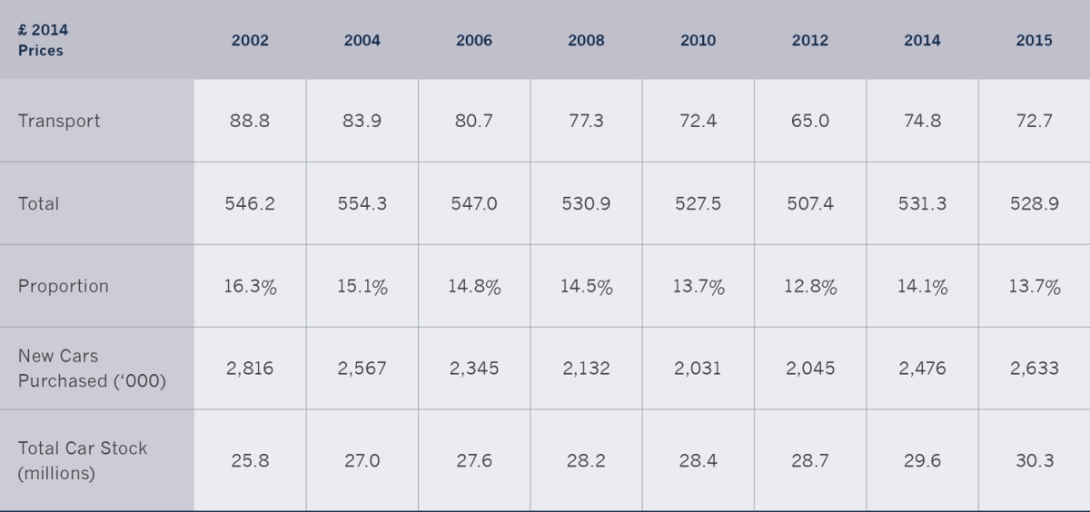
Notes: The new car sales for 2011: 1,941,000; for 2013: 2,265,000; for2015: 2,663,000: and for 2016: 2,690,000.
Sources: Based on ONS, 2015 and DfT, 2016, table VEH0202.
Analysis of these recession data was not carried out on an income basis, but on the COICOP4 (Classification of Individual Consumption by Purpose) and the Super OACs5 (Output Area Classification) (table 4.4). There seems to be little change in expenditure patterns over the recession period, with the exception of the Multicultural group where there was a significant increase, and here the transport share of total expenditure increased from 12.5 per cent (2007) to 14.9 per cent (2010).
Table 4.4. Mean COICOP weekly household expenditure on transport by super OAC group (weighted) for 2007 and 2010 for UK.
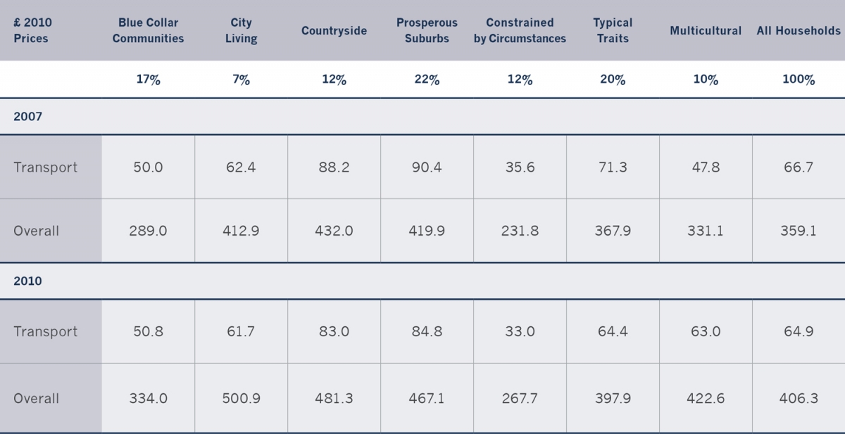
Note: Overall is total expenditure. The percentage figures give the proportion of all households in each of the 7 OAC categories.
Source: Based on ONS, 2011.
When the purchase of vehicles is investigated, there is a significant fall in the amount spent for three categories – Countryside, Typical Traits and Prospering Suburbs. Households in the Countryside and Prospering Suburbs Super OAC groups have significantly increased their expenditure on the operation of personal transport (including fuel). There is a balancing process between reductions in vehicle purchase and a corresponding rise in fuel costs. At this time (May 2009–March 2010), there were also incentives to scrap vehicles through new vehicle subsidies (SMMT, 2009).
Transport services expenditure (including public transport) increased significantly over this period for the Typical Traits and Multicultural Super OAC groups, and for the latter group this was a result of increases in international air travel expenditure and probably reflected the increase in the real costs of air travel during this period (ONS, 2011, p. 105), as visiting family and friends abroad is likely to be a major component of the Multicultural Super OAC group outgoings. This travel is not seen as being discretionary expenditure. These two groups increased their expenditure on public transport, while the Countryside and Prosperous Suburbs Super OAC group chose to spend more on car travel as a result of the higher operating costs. The ONS (2011, p. 106) report concluded that ‘the recession, while not appearing to have had a substantial impact upon overall COICOP expenditure for the average household, may have altered expenditure patterns in complex ways that are largely determined by specific household characteristics’.
The overall picture presented here of household transport expenditure patterns over the review period (2002–2012) in the UK is that it has been one of steady decline. This is good for reducing levels of inequality. However, there is still a huge difference when the aggregate figures are examined by income decile, as the amounts spent on travel by the rich far exceed those of the poor, often by a Factor 10 or more.6 This suggests that there are substantial historic differences in expenditure on travel across income categories. There are also regional differences and variations by the Super Output Area Classification, but these are not so great. Over time the proportion of expenditure allocated to private (and public) transport has remained constant (85 per cent and 15 per cent). The impact of the recession that occurred in the middle of the review period is not great, even though it has led to short-term effects on new car sales, with people keeping their cars longer. The greatest volatility in the patterns of household expenditure on transport has come since 2012, as the overall levels of expenditure have increased, mainly explained by the rise in public transport fares. This brief review of the patterns of household expenditure provides the context within which the more detailed patterns of travel can be placed.