A range of inequality indicators were introduced in Chapter 2, and three of these have been applied here to income and travel. The aim has been to analyse the variations between the income ventiles for the period 2002 to 2012 in Great Britain, with data taken from the National Travel Survey. The Palma Ratio measures the ratio of the highest 10 per cent over the lowest 40 per cent. This means that an index of 0.250 reflects equality between the income deciles. In this analysis, the Palma Ratio has been scaled up (by 4 times) to make it more easily comparable with the other indices used, so that the nearer the value is to 1, the lower the levels of inequality. The other two ratios measure the direct correspondence between the top and bottom of the income ventiles, taking the 20:20 Ratio and the 10:10 Ratio. In each of these measures, unity is the equality situation.
The interpretation is that an index of 1 means that there is no inequality across the income ventiles. If the index is below 1, the low-income groups are making more trip stages, travelling further, and spending more time travelling for each mode of transport considered – and the reverse is true if the index is over one. The simplicity is an advantage, and the primary concerns over the gap between the top and the bottom provide the main rationale for their use, but the values produced give only a partial perspective on inequality. The focus on the top and the bottom of the income range is deliberate, as this is where most of the differences already observed in this chapter are apparent. It also responds to the evidence cited in Part I of the book about the lack of change over the central part of the distribution. The Palma Ratio explicitly states this as the rationale behind the focus on the top 10 per cent and the bottom 40 per cent of the income distribution (Palma, 2011).
There are three sets of indices presented that cover trip stages, trip distances, and travel times, looking at the changes between 2002 and 2012 for the different modes of transport. These composite indices are then supplemented by a more detailed set of values that reflect changes in trips and distance travelled for a longer period of time, as disaggregated by mode and income decile (from 1985 to the 2000s, where the most recent 10 years of data have been pooled).
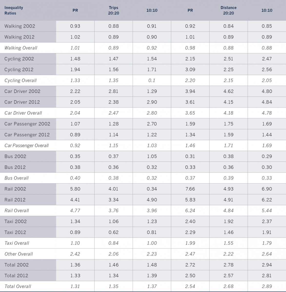
Inequality Indices (2002–2012)
Trip Stages: Walking is the most ubiquitous (equal) form of transport, as measured by the Palma Ratio (1.01), and the 20:20 and 10:10 Ratios (respectively, 0.89 and 0.92). The lowest income group has the greatest propensity to walk, but not by very much. It is the bus mode that the poor use much more than the rich, with the Palma Ratio being 40 per cent of the equality value (Palma Ratio = 0.40), and the other two measures being 0.34 and 0.38, respectively. This means that the poor make about 2.5 times more use of the bus than the rich. For car passengers, there is little variation by income (Palma Ratio = 0.92, with the other two measures being 1.15 (20:20) and 1.05 (10:10). The taxi has a similar pattern, and use is not differentiated by income (Palma Ratio = 1.10, 20:20 = 0.84, 10:10 = 1.00). For cycling, there is an income effect (Palma Ratio = 1.33, 20:20 = 1.35, 10:10 = 1.29) suggesting that high-income people make between 30 and 35 per cent more use of cycling than the poor.
It is for the other three modes that real differences are apparent. For car drivers, the figures are about twice as high for the rich income categories as for the poor categories, with some evidence of increasing differences as income increases (Palma Ratio = 2.04, 20:20 = 2.47, 10:10 = 2.70). For the other modes,10 a similar picture can be found (Palma Ratio = 2.42). The greatest difference is found in rail, with the rich making about four times as many trips as the poor (Palma Ratio = 4.77, 20:20 = 3.76, 10:10 = 3.96). The Palma Ratio gives the highest Ratio, but the other indices also have values nearly as high. The overall conclusion for trip differences by income is that the rich make about a third more trip stages than the poor for the main modes of travel (car, rail and ‘other’ modes) that account for about 70 per cent of all trips made (table 4.5).
The figures given above are for the pooled data over the 10 years (2002– 2012), but a slightly different picture is apparent when change is looked at over this period. Generally, the gap between the rich and the poor, as measured by trip stages, has narrowed for all modes, except cycling (table 4.11). The largest changes have come in rail and taxi use, where the gap has narrowed by between 11 and 42 per cent, depending on the measure used. The interpretation here is that increases have taken place in rail and taxi use over the 10 year period, but this has been from relatively low base levels in the case of low-income groups. This means that the percentage increases have been high, but in absolute terms the increase is often less than that in the highest income groups, where the base level (2002) was already high. This observation is certainly true for rail travel, but less so for taxi trips, where the use among the low-income groups is at a much higher level for the base year (about 15 trips per person in 2002) than across the whole income spectrum, except for the highest income category (about 22 trips per person in 2002).
Trip Distance: A similar pattern emerges when trip distance is used (table 4.11), but the differences by income are even more apparent, meaning that the rich make longer trips as well as more trips. Distance measures both the frequency of the activity and the length of journeys. Again, it is walking distance that has the clearest pattern of equality across each of the three indices, with a small margin in favour of the poorest income groups (Palma Ratio = 0.98, 20:20 = 0.88, 10:10 = 0.88). Bus distance is strongly in favour of the poorest income groups, with the poor travelling about 2.7 times the distance as the rich (Palma Ratio = 0.37, 20:20 = 0.39, 10:10 = 0.33). For car passengers, the distance differences are more apparent than for trips, with the levels for the rich being about 50 per cent higher than those for the poor (Palma Ratio = 1.46, 20:20 = 1.71, 10:10 = 1.69). For taxi and cycling, there is a similar picture but the differences are greater, with about a two times difference between the top and the bottom of the income range (Palma Ratio = 1.99 and 2.20; 20:20 = 1.55 and 2.15; 10:10 = 1.79 and 2.05 respectively).
With the other three modes that make up most of the travel distance across all the population, the differences between the rich and the poor is of an order of magnitude greater for each of the inequality indicators used. For the other modes, the travel distance difference is 2–3 times (Palma Ratio = 2.47, 20:20 = 2.22, 10:10 = 2.64), for car drivers it is about 4 times (Palma Ratio = 3.65, 20:20 = 4.18, 10:10 = 4.78), and for rail it is over 6 times (Palma Ratio = 6.24, 20:20 = 4.84, 10:10 = 5.44). This means that the net effect of distance is that the inequality ratios are about twice as high as those obtained for the trip data. As noted above, this means that the rich travel much further than the poor, as well as making more trips. When the poor travel more than the rich (for bus and taxi), their overall use of these modes is relatively small in terms of the total patterns of trip making, as they are more than outweighed by the importance of the modes used by the rich (car, rail and other modes). This comment is reinforced when long-distance (over 50 miles or 80 km and over 100 miles or 160 km) trips are separated out, as the inequality ratios all increase even further (Chapter 5).
Table 4.11. Inequality indices and trips stages and distance 2002–2012.
Notes: These figures relate to all the data from 2002–2012. Other has not been included, except overall. The Palma Ratio has been multiplied by 4 to make the values compatible with the other in equality indices. Values close to (or below) 1 demonstrate equality, and the values higher than 1 show increasing levels of inequality.
Travel Time: For the third travel variable (travel time), the picture is rather different. Overall, there is a difference between the rich and poor, yet it is not so pronounced. The rich allocate about 40 per cent more time for travel activities not in work on each of the three indices used. Looking at the data disaggregated by location, there does not seem to be much variation, perhaps with a slightly higher time allocation for the rich in rural areas. When the data are disaggregated by distance, there is a substantial difference in travel times by income. The rich allocate about 4–5 times as much time to long distance trips (over 50 miles or 80 km and over 100 miles or 160 km) than the poor. Again, this is consistent across all inequality indices.